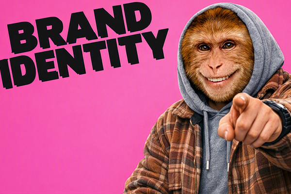
we see too much average junk out there on the internet.
is your brand standing out from the crowd?
you gotta know how to move in a room full of sharks.
If your not creating your brand image, your competitors will do it.
🍌 WHAT THE HELL IS BRAND IDENTITY?
Brand identity is the collection of visual and verbal elements that define where your placed in the market.
That includes your logo, colors, typography, photography, graphics, messaging, tone of voice, packaging, website, social media, and even the little details people might not notice consciously.
Think about the brands you recognize instantly. You might not even see the company name. The colors, shapes, fonts, and overall style already tell you who it is.

unique energy and readability and understandability. got it? good!
THE 8 PARTS OF A STRONG BRAND IDENTITY
A memorable brand identity does not happen by accident. It is built from several connected pieces that work together.
A LOGO WITH A PURPOSE
Your logo should identify your business clearly and work across different sizes and platforms.
- Is it recognizable?
- Does it work in black and white?
- Does it look good on a website, shirt, and business card?
- Does it actually fit your business?
A logo does not need to explain everything you do. It needs to give people a strong visual starting point.
A COLOR PALETTE PEOPLE REMEMBER
Color creates recognition and emotion quickly. The right colors can make your business feel energetic, trustworthy, premium, playful, serious, or approachable.
- Choose a primary brand color.
- Choose supporting colors.
- Define light and dark versions.
- Use the same colors consistently.
Five random colors are not a brand palette. Choose colors with intention.
TYPOGRAPHY THAT SOUNDS LIKE YOU
Fonts have personality. A heavy display font feels different from a refined serif or a clean geometric sans-serif.
- Choose a headline font.
- Choose a body font.
- Set consistent sizes and spacing.
- Make sure everything stays readable.
Your typography should support your personality, not fight against it.
A CONSISTENT VISUAL STYLE
Your photos, illustrations, icons, graphics, and layouts should feel like they belong to the same brand.
- Use a consistent image style.
- Repeat recognizable graphic elements.
- Keep layouts connected.
- Avoid using a different style for every post.
Consistency does not mean boring. It means people can recognize your work.
A VOICE THAT SOUNDS HUMAN
Your brand needs a personality in words, not just visuals.
- Are you professional or playful?
- Are you direct or conversational?
- Do you use industry jargon?
- Would a real person actually say this?
If your website sounds like it was written by a committee, people will feel that immediately.
A CLEAR BRAND MESSAGE
People should understand what you do, who you help, and why it matters.
- What problem do you solve?
- Who is your ideal customer?
- What makes your business different?
- Why should people choose you?
Looking good is important. Making sense is even more important.
BRAND GUIDELINES
A brand identity becomes much easier to maintain when the rules are documented.
- Logo usage rules.
- Color codes.
- Font selections.
- Photography direction.
- Voice and messaging guidelines.
Brand guidelines help your business stay consistent even when multiple people create content.
A BRAND THAT WORKS EVERYWHERE
Your identity should work across every customer touchpoint.
- Website.
- Social media.
- Business cards.
- Packaging.
- Signage.
- Email marketing.
- Advertising.
If your Instagram looks modern but your website looks like it was built in 2008, your brand is sending mixed signals.

WHY BRAND CONSISTENCY MATTERS
Imagine seeing a company use yellow and black on Monday, purple and pink on Tuesday, and three completely different fonts on Wednesday.
Even if the business is excellent, the inconsistent visuals make it harder to recognize and easier to forget.
Consistency builds familiarity. Familiarity builds trust. Trust makes people more comfortable choosing you.
IF PEOPLE HAVE TO GUESS WHETHER IT IS YOUR BRAND, YOUR IDENTITY NEEDS WORK.
BRAND IDENTITY VS. BRAND IMAGE
These two terms sound similar, but they are different.
Brand identity is what you create and control: your logo, colors, fonts, messaging, visuals, and personality.
Brand image is how people actually perceive you.
Your goal is to build an identity that creates the image you want people to have of your business.
YOUR BRAND SHOULD FEEL LIKE SOMETHING
The strongest brands do not just look polished. They feel intentional.
They have a point of view. They have a personality. They know who they are and who they are trying to reach.
Your brand identity should make the right people think:
“THAT BUSINESS GETS ME.”
That is the difference between having a logo and having a brand people remember.